Branding
Bay Avenue
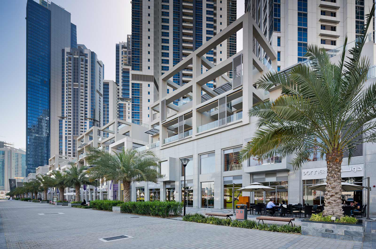
Bay Avenue is a premium mid-size commercial strip mall developed by the Dubai Properties Group and at the very heart of Business Bay in Dubai.
DPG and Masat contracted a consortium of Limelight Creative Services, Pallavi Dean Interiors and IKTOMI to completely overhaul the site through a new brand strategy, concept interior design and a full signage and way-finding programme. IKTOMI’s responsibility was to unify the visual identity as well as create the full signage programme.
Although beyond the initial scope of the project, after an in depth brand strategy project, we decided to develop a completely new brand that would overhaul an aging identity and inform the signage design for the space at a higher standard.
Concept
Following a detailed benchmarking and competitive analysis, alongside a complete visual site audit and environmental analysis, we developed a strong Brand Strategy to create a unique positioning for the destination.
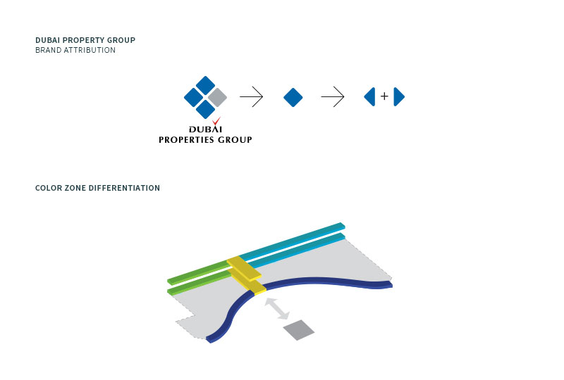
One of the objectives of the project was to provide some element of attribution to the parent company Dubai Properties without being trapped by the rigidity of the more corporate imagery of the holding company.
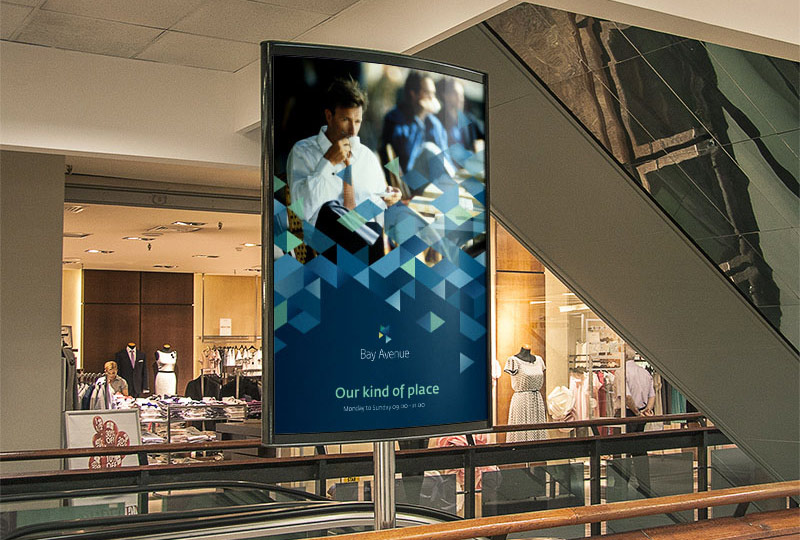
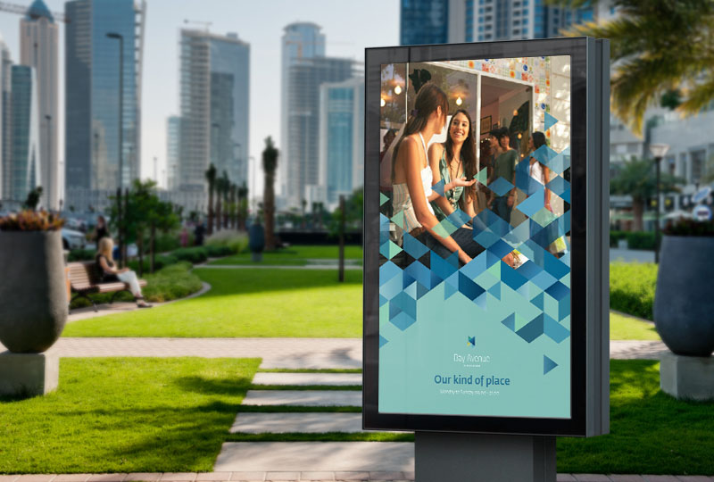
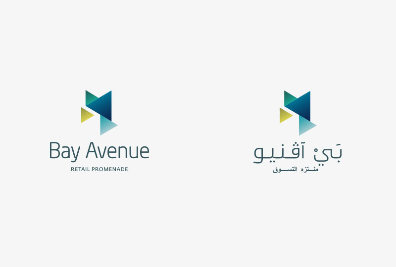
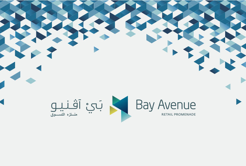
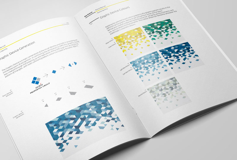
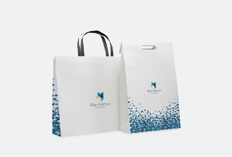
We achieved this by taking inspiration from the logo and adapting it to create a brand new iconography based on triangles that subtly evokes without replicating, and allows the flexibility to create vibrant patterns.
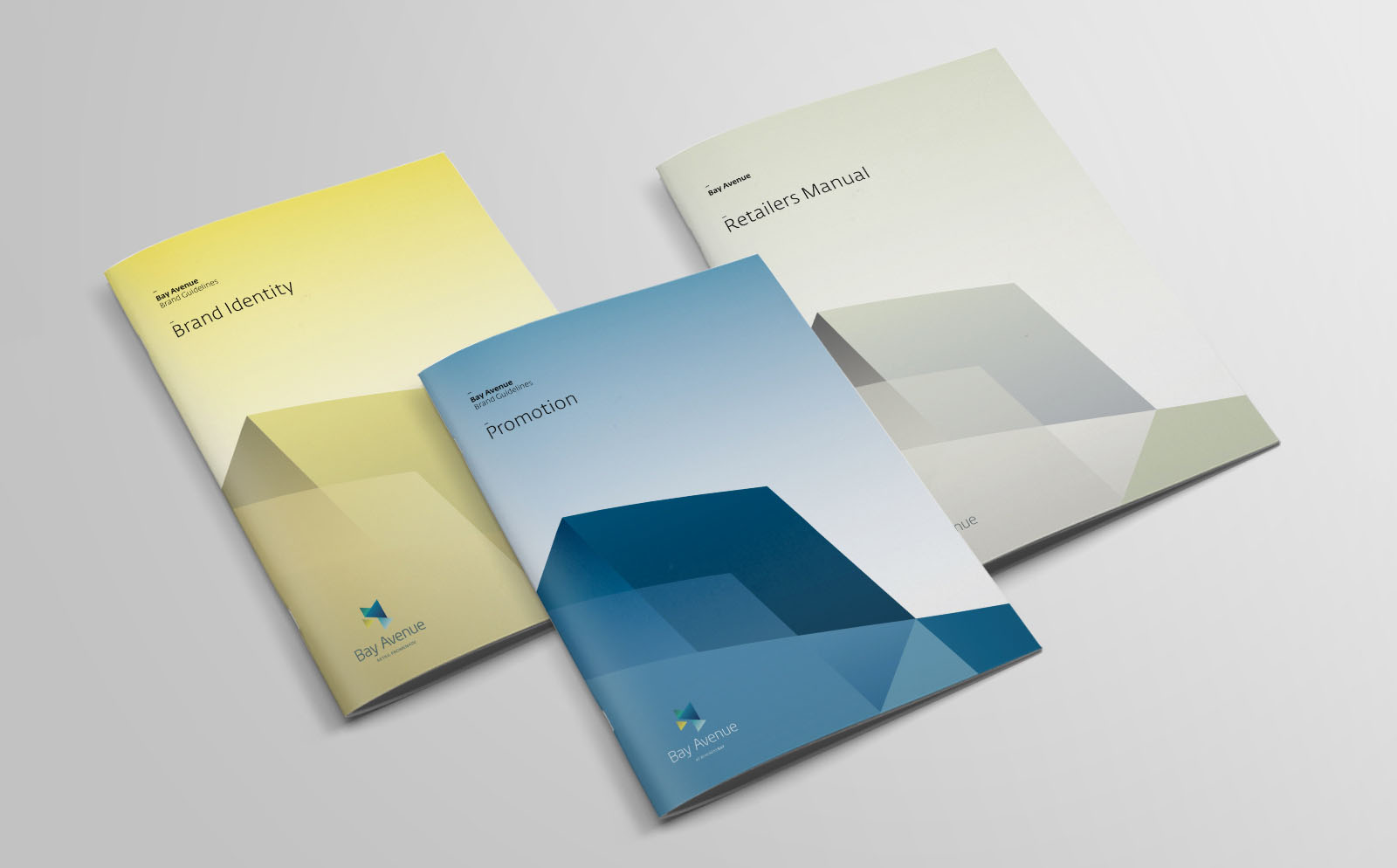
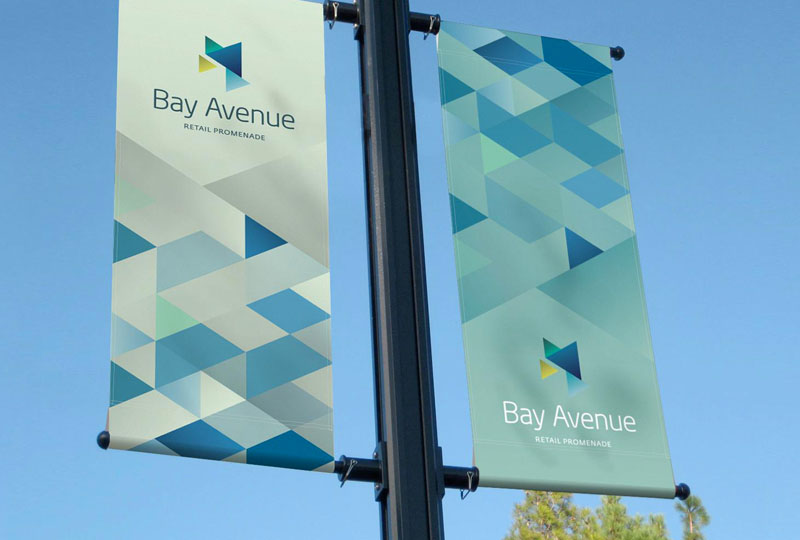
A set of brand toolkits to create a consistent language.
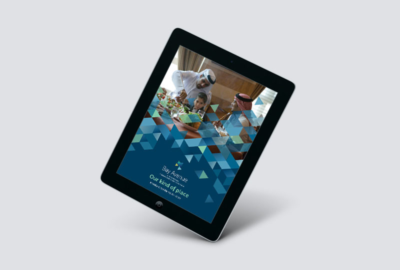
We designed a sparkling Brand Identity that extended across all facets of the mall, create a true sense of space that was both functional and attractive.
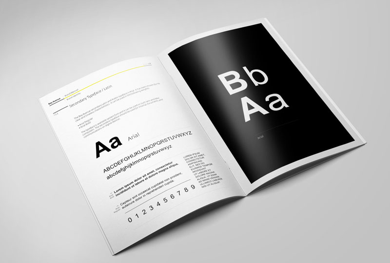
All the designs were collected into a carefully designed family of brand toolkits, including a main and complete Brand Manual, a Promotions Manual, an Environmental manual and full and detailed Guidelines and Manual for Retailers. Each of these manuals were created with their own unique features for increased usability, but were also balanced and coordinated to create a consistent language.
A unique sense of space.
– Ferdinand de Saussure
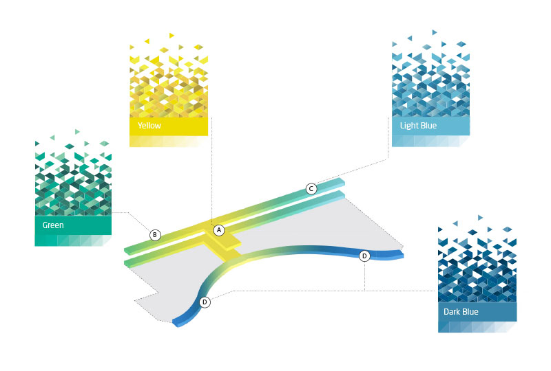
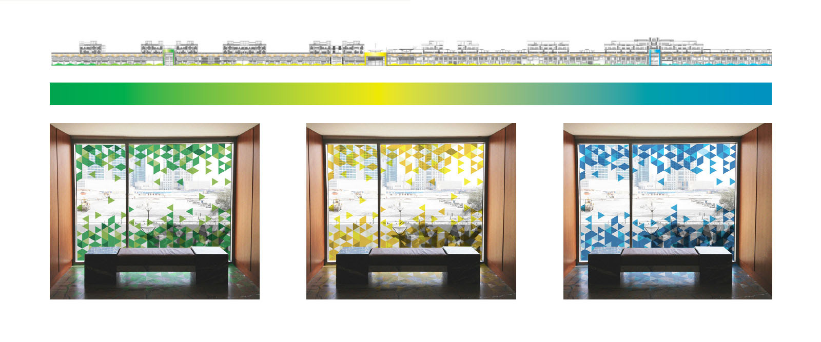
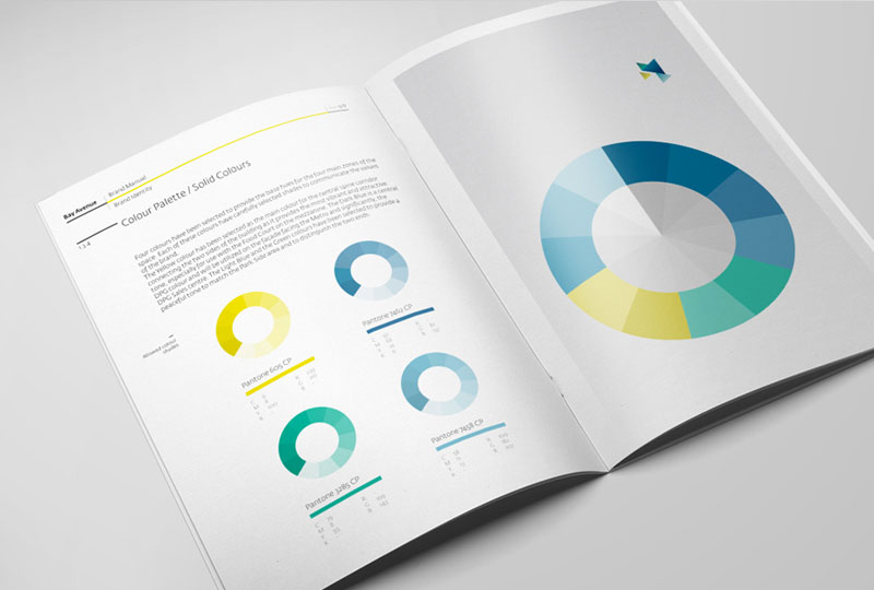
The logo was also developed in part as a visual representation of the site itself and as a centrepoint of the signage and wayfinding strategy. The mark is made up of four triangles and four different colours, each representing a zone for easy identification. We wanted to directly evoke and play with the space in all its representations.
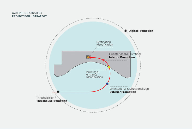
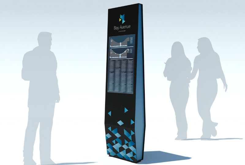
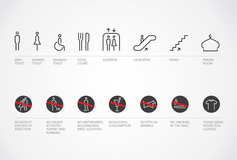
A full wayfinding, signage strategy and signage program was developed to not only provide effective orientation for the visitor, but also to create a unique sense of space. From orientation, through directional to confirmation signage, each of our designs are playful yet instructive.