Branding
JT+Partners
JT+Partners is an innovative brand in architecture, masterplanning, and integrated design practices. Delivering projects around the world, spanning commercial, hospitality, residential, mixed-use, and masterplan developments.
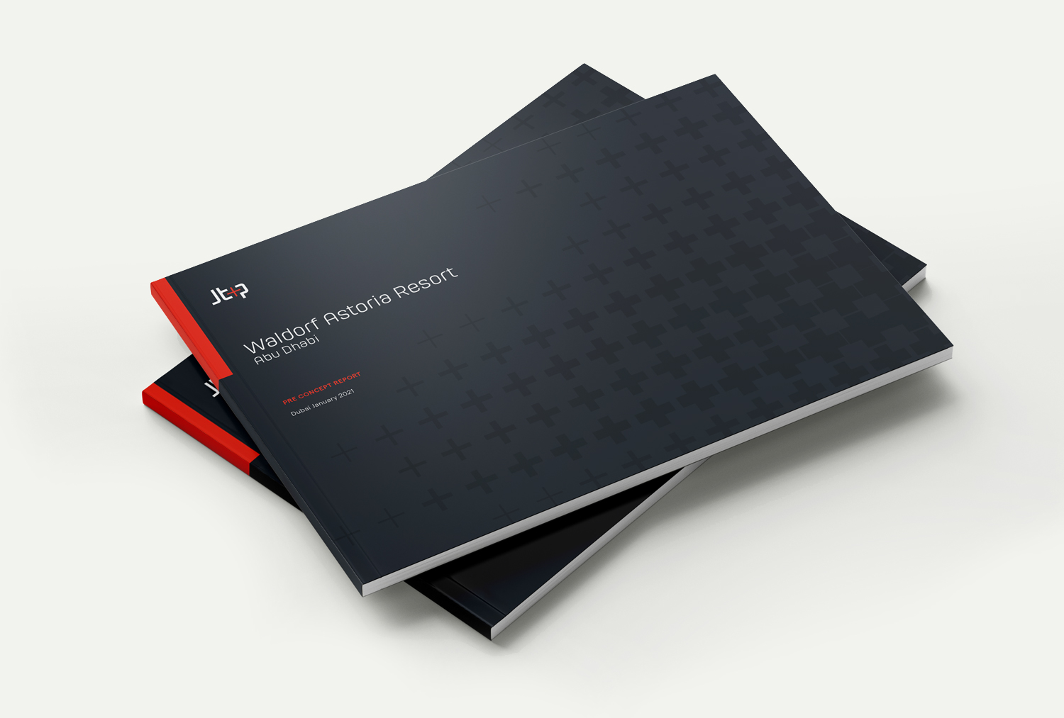
IKTOMI was asked to revamp the JT+P brand identity and ensure uniformity in visual communications across all client touchpoints.
From success to excellence
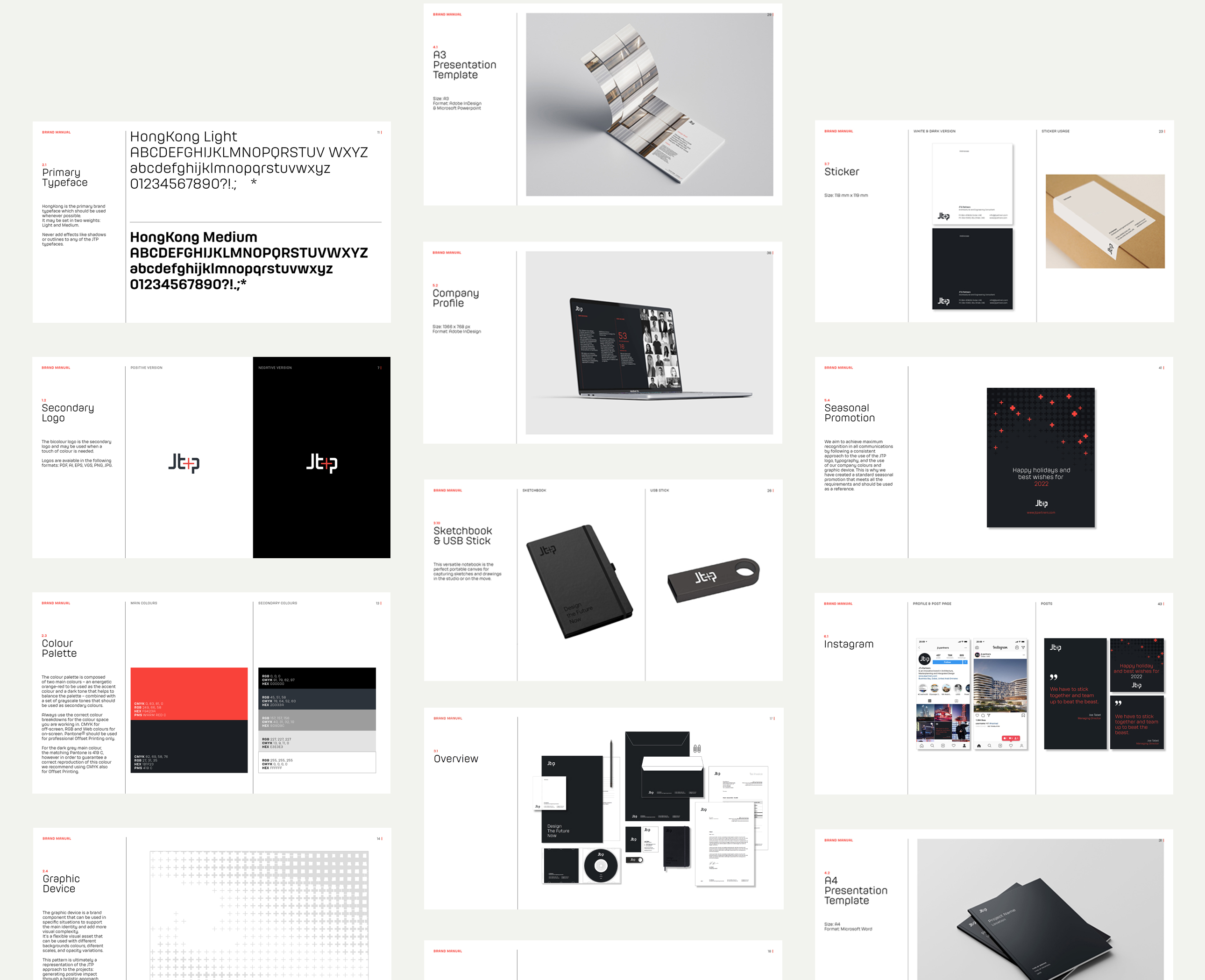
The rebranding exercise sealed the firm’s transition from success to excellence, or in other words it marks the transition from the past to the future.
The difference between success and excellence resides not only in creating beautiful designs but in executing projects that truly give meaning to their surroundings. Excellence lies in generating a positive impact founded on the total addition of collaborative, environmental, social and economic considerations.
We aimed to gather and synthesize the representation of this transition through the iconic “+” sign and its strong symbolism which also represents the collaborative spirit of the JT+Partners team.
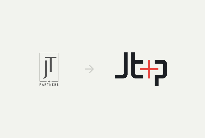
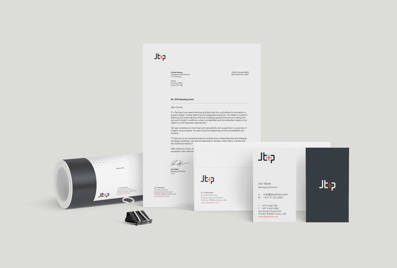
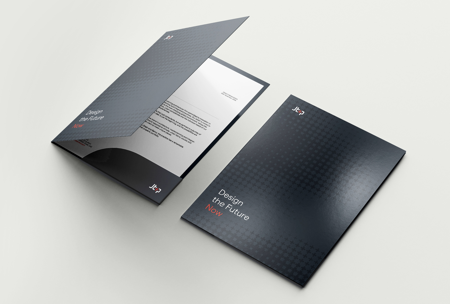
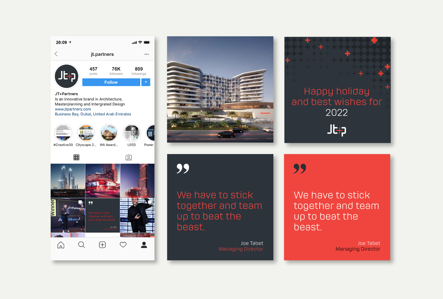

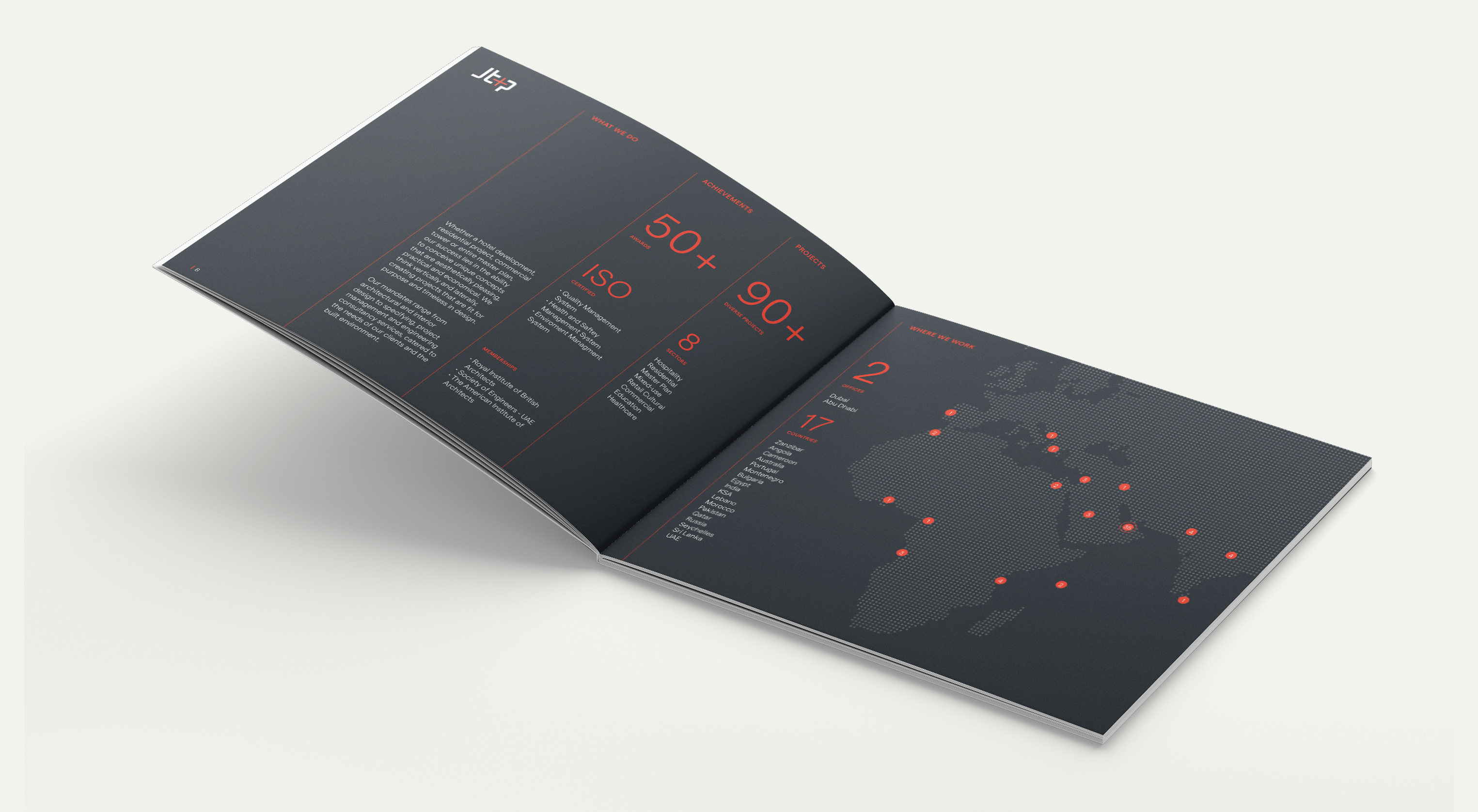
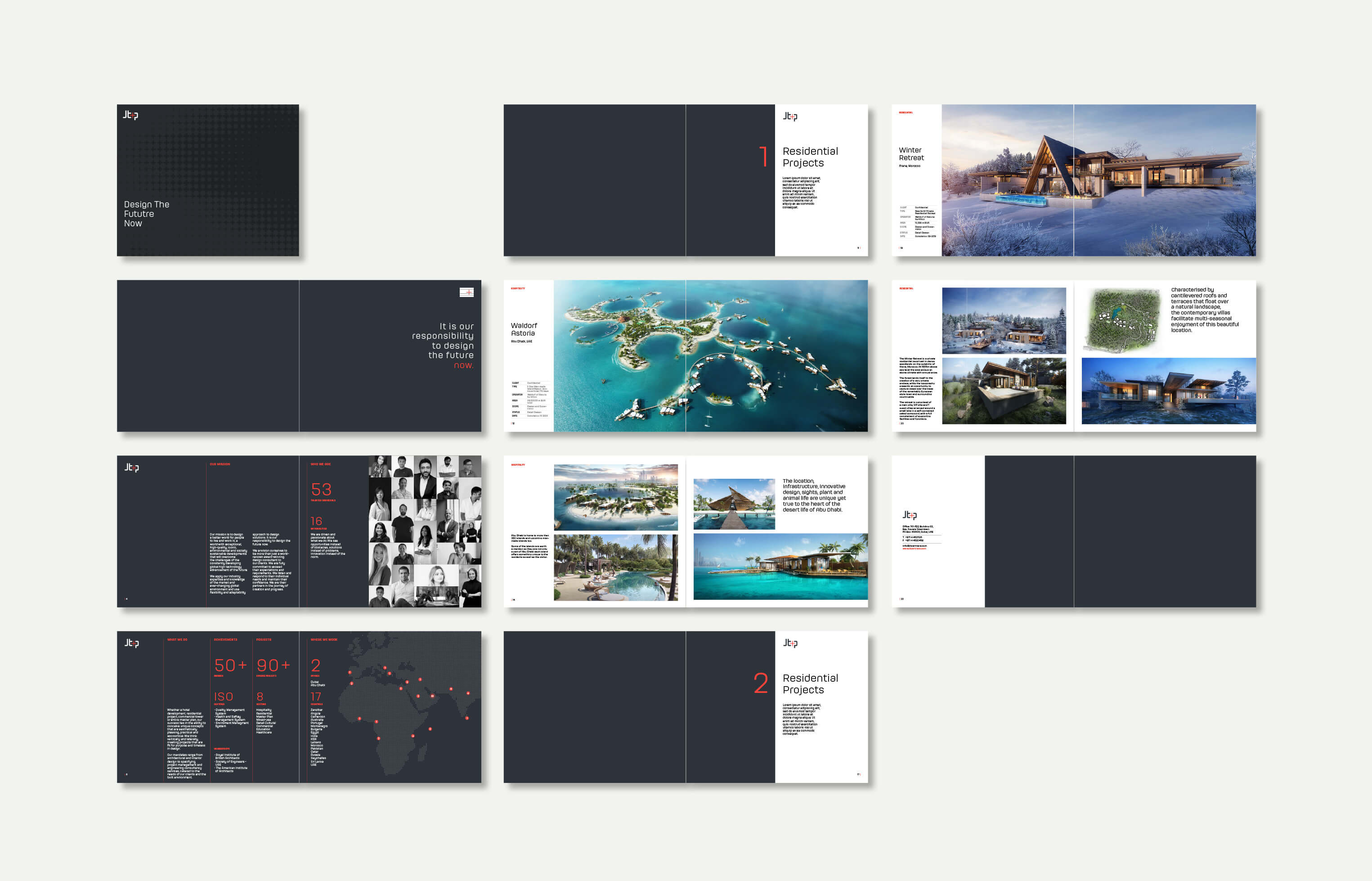
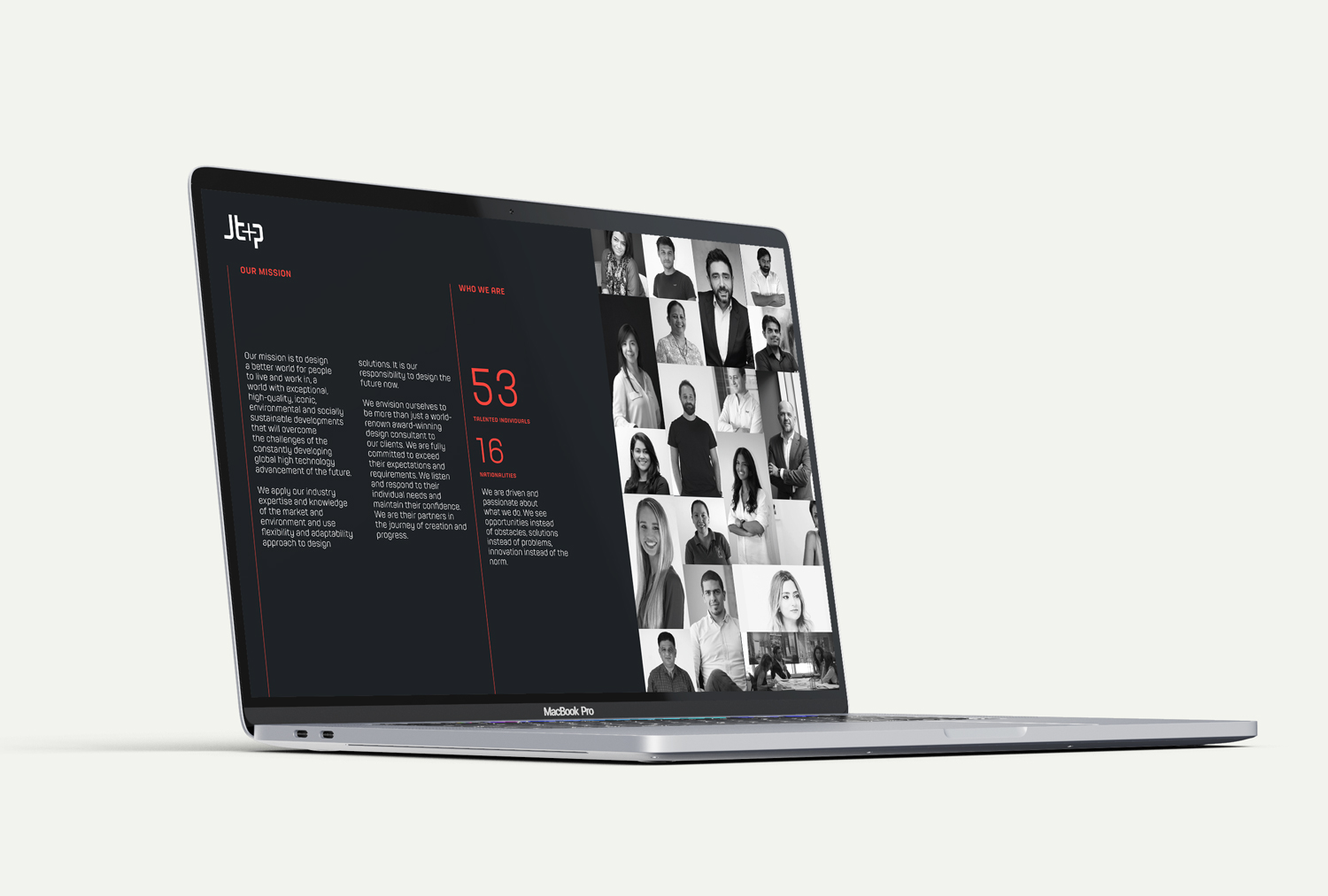
Next to a new visual identity, we were asked to create a consistent and coordinated communication system that implements and expresses the JT+P Brand and ensures that anyone who needs to create any kind of communication material for JT+Partners can do so to a consistently high standard.
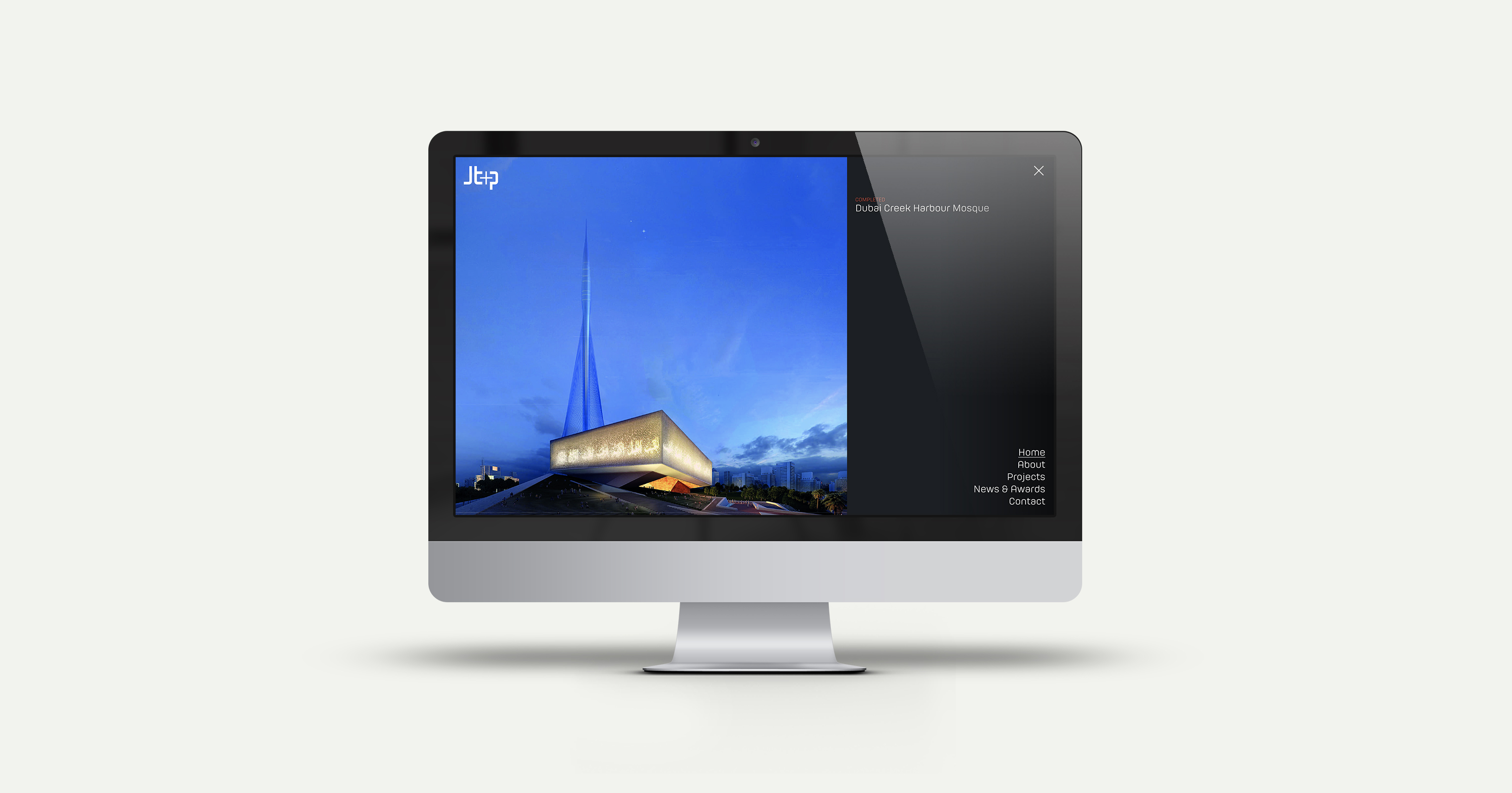
The extensive communication system is composed of printed and digital assets, including presentations templates, social media visual guidelines, the website, and several marketing materials as the digital company profile, a printed brochure, and the newsletter.
Featured by Best Design Award
