Branding
U Energy
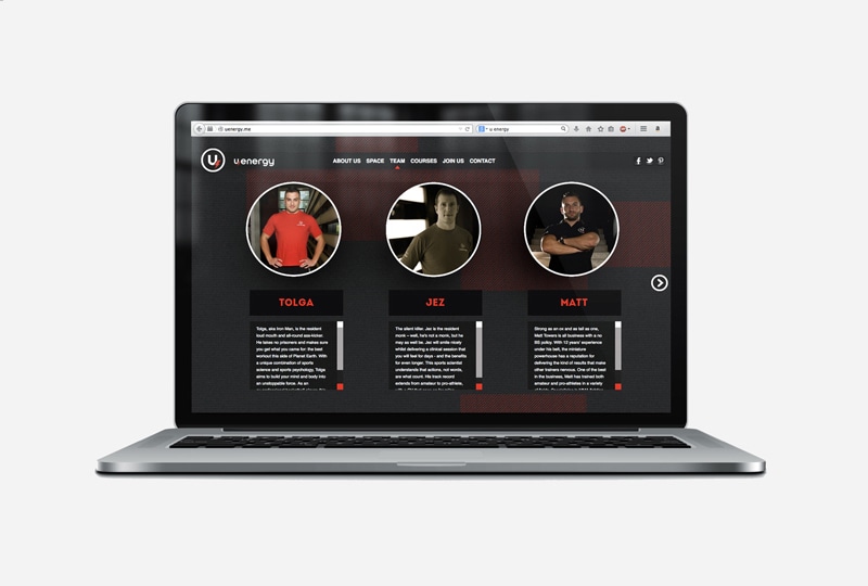
U Energy are a chain of exclusive boutique health clubs in the UAE and Lebanon with a focus on carefully designed experiences.
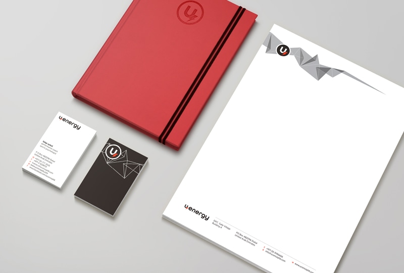
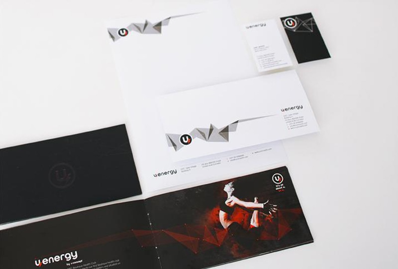
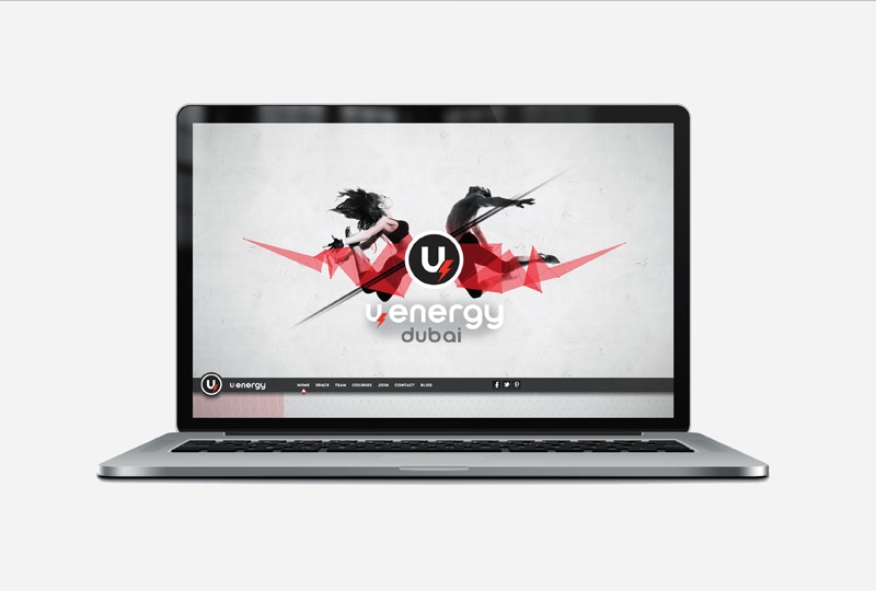
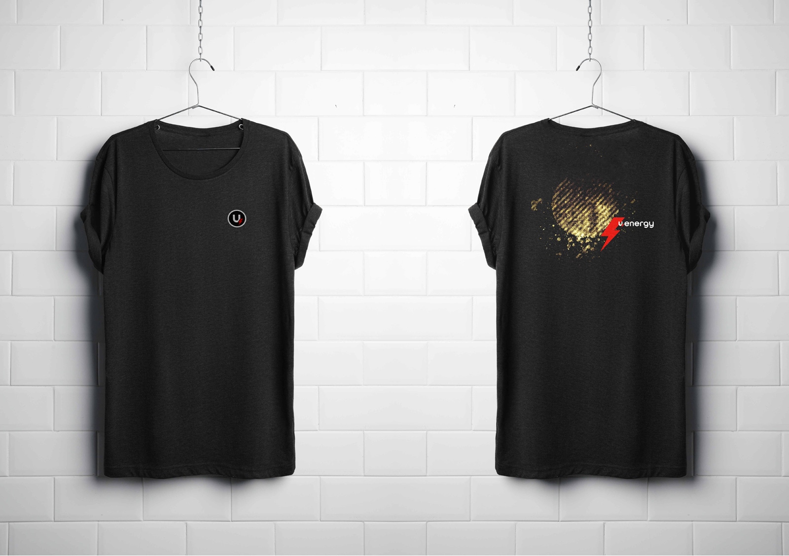
Iktomi were approached to develop a full brand design, through a new logo and visual identity, website and promotional material for a bold and brash new chain of gyms nestled in the heart of the financial and commercial districts of Dubai and Beirut and boasting an unparalleled experience by combining innovative design, health science with luxury.
Concept
– Bridget Riley
The client needed a bold and strong visual identity to capture the essence of the gym, yet this physicality also needed to sit in a more refined visual spectrum to capture the specific up-market positioning.
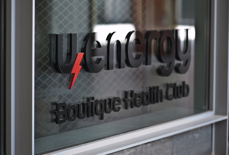
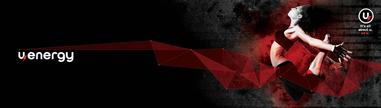
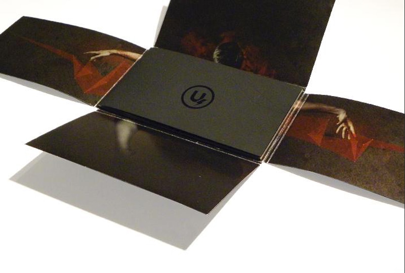
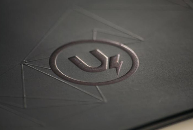
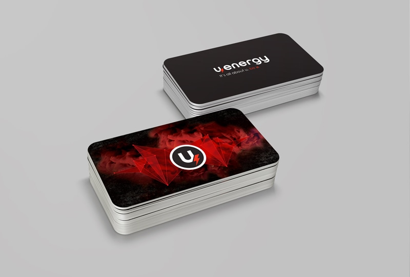
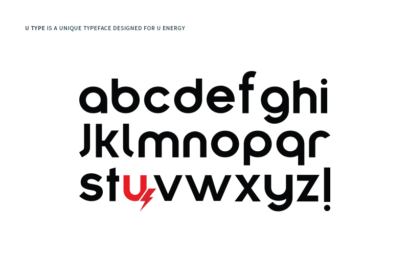
To attain this we designed “U Type”, a unique custom typeface and developed a bold logotype which was then matched with a secondary visual language that evoked the very essence of movement. The polygons and dynamic shapes very expressively convey the impression of coiled power and dynamic movement.